• Skip to primary navigation
  • Skip to main content
  • Skip to footer
LMFD logo

Laura M. Foley Design

Cheat Death by PowerPoint!

  • Capabilities
    • Presentation Design
    • Presentation Rebuild
    • Presentation / Webinar Audit
    • Next-level Presentation Training
      • Presentation Chat
      • Rocking Your Remote Presentations
      • Slide Makeovers LIVE!
      • Presentation Skills for Brainiacs
      • Mastering Your Ignite Presentation
      • Laying Foundations for Great Presentations
      • Customized Presentation Training
    • Webinar Development
    • Marketing
    • Speaking
  • Resources
  • Blog
  • Portfolio
    • Motion Graphics and Loops
    • Sample Presentations
    • Slide Makeovers
    • Graphic Design
    • Illustration
  • About
  • Connect

Do you need header and footer blocks on PowerPoint slides? No.

You are here: Home / Mistakes / Do you need header and footer blocks on PowerPoint slides? No.

September 20, 2012 by Laura Foley Leave a Comment

We see it all the time—a slide that has a large, colored bar along the top for the title and another one along the bottom for a logo, page number, and various other footer items. Why has this become the norm? It’s true that many of the templates that come standard with PowerPoint use this convention, so maybe people think it’s OK to follow it. Well, folks, the doctor is IN and I’m here to tell you that this convention stinks.

Not only do your slides look boring and uninspired as a result of using large headers and footers, you’re also squandering valuable real estate.

Jim Smith is a colleague of mine who specializes in helping healthcare organizations to use and present data more effectively. He has a real problem with these types of slides, and so have I. Jim’s come up with a great way to demonstrate how much space is wasted when you design slides in this way, and he has graciously agreed to allow me to share it with you.

Let’s revisit a slide that was featured in a Slide Makeover of the Month earlier this year.

Tuskegee Airmen slide: before

Pretty typical stuff, right? But let’s look at the area of the slide that’s devoted to these running headers and footers.

Headers and footers take up too much space

As you can see, a significant amount of real estate is gobbled up with these headers and footers.

Let’s see what the first slide looks like without the header and footer:

Tuskegee Airmen slide: after

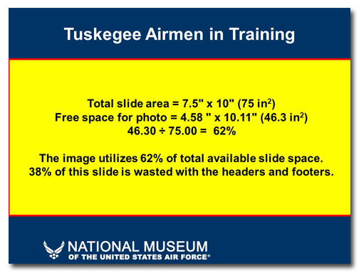
Now the photo can be much bigger, giving it more impact and allowing the audience to see the details. And here’s the math:

Create more space by eliminating headers and footers

Just because other people are using these oversized header and footer blocks doesn’t mean you have to do it. If all the boring presentation designers jumped off the Empire State Building would you do it too?

Like this:

Like Loading...

Mistakes,  PowerPoint,  Presentation Skills Cheating Death by PowerPoint,  Death by PowerPoint,  decks,  mistakes,  presentation,  slides

Footer

Social

  • Email
  • Facebook
  • LinkedIn
  • YouTube

Contact

AS OF 2022, LAURA M. FOLEY DESIGN IS NO LONGER IN BUSINESS. THIS WEBSITE REMAINS FOR ARCHIVAL PURPOSES.

Navigation

  • Capabilities
    • Presentation Design
    • Presentation Rebuild
    • Next-level PowerPoint Training
    • Webinar Development
  • Speaking
  • Resources
  • Blog
  • Portfolio
  • About
  • Connect

Copyright © 2025 · Laura M. Foley Design· All rights reserved. As of 2022, Laura M. Foley Design is no longer in business. This website remains for archival purposes.


Loading Comments...
 

    %d