In January 2014 I wrote about the top 5 top PowerPoint resolutions you should make for the new year. One of these was to avoid complex tables because they make the audience work too hard to understand what’s on the slide. Because tables contain mostly text and numbers, not only do people need to read them, they also have to analyze what they’ve read and determine what’s important. And if your audience is busy examining tables, do you know what they’re not doing? That’s right: they’re not paying attention to you.
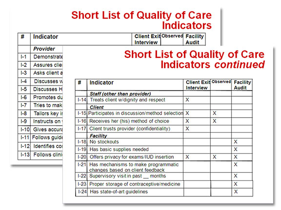
I included a screen grab of a pair of heinous slides to illustrate what you shouldn’t have in your presentation:
Naturally, some of you questioned how I would redesign these slides. After all, there is a lot of stuff contained in these tables. If I edit them to show less information, then won’t that make the slides less informative? Isn’t everything contained on these slides important? Well, yes and no.
Interestingly, in this example and in many other similar slides I’ve redesigned for my clients, the information contained in the tables isn’t important. What is important are the trends, results, or meanings behind the data. So you need to dig a little deeper to realize what you’re really trying to communicate.
What do you want to say?
The answer was in the Speaker Notes of these slides. The copy is a bit dry, but please read everything so the rest of this article will make sense.
[box style=”quote”]
Speaker Notes (slide 1)
This is a list of the 24 quality of care indicators identified and field tested in multiple countries by the Monitoring and Evaluation Subcommittee.
Purpose of developing QC indicators:
- Develop a low-cost, practical methodology for measuring QC in clinic-based FP services
- Provide USAID Mission with QC indicators for use in the R4 process
- Develop an approach to monitoring quality that would be useful to CAs, NGOs and other donors
Speaker Notes (slide 2)
The final product from the quality of care field-test will be a package of materials for organizations interested in monitoring quality of care. It will cover the following topics:
- Short list of indicators
- Sampling issues
- Instruments for data collection
- Field guide for supervisors
- Analysis plan
- Illustrative presentation formats for data[/box]
After I read the speaker notes, it all became clear to me, as I hope it did for you. The fact is, there’s no need to show all 24 quality care indicators broken across two slides. The presenter doesn’t want to tell her audience what the QC indicators are. Instead, she wants to tell people why QC indicators are important, who can benefit from them, and what can be done with them.
So here’s how I would redesign these slides:
Is this a cop out? Not at all!
I’m sure that many of you think that I avoided the problem by eliminating the tables and not redesigning them. Well, I took the Kobayashi Maru approach: I changed the parameters of the problem. Rather than seeing this as an exercise in table design, I recognized it as an opportunity to focus on the real message and to eliminate unnecessary visual clutter. I’m willing to bet that when you include large tables in your own presentations, you want to illustrate what the data represent, rather than the data itself.
Are there times when it’s important to include large amounts of data in tabular format in your presentations? I’m sure there are. But remember that you’re adding a layer of complexity to your slides that may or may not serve the purpose of your presentation. Always being aware of what you’re trying to communicate will inform your decision whether or not to include complex tables in your presentation.
If you want to know why people hate PowerPoint, this is it. Unless they contain very few cells and data that can be viewed easily, tables should NEVER be included in slides! My personal pet peeve is when a presenter puts a complex table or chart on a slide and then says, “I know you can’t read this, but…” Laura’s solution here is spot-on (though I would have varied the graphic to create more visual interest); if the tables are that important, include them as handouts, or provide links to them online so the audience can study them in detail later.
That’s a valid criticism of the graphic, but I had a definite reason for not changing it: I usually don’t purchase images for my blog posts if I can help it, and this was the most relevant image available in PowerPoint! However, on screen these slides would have the effect of just the text changing, not the graphic, so it would read more as a type build.
“…you want to illustrate what the data represent, rather than the data itself.” Absolutely.
One of my favourite Nancy Duarte quotes: “Data slides are not really about the data. They are about the meaning of the data.” To the extent that I actually went and bought Stephen Few’s “Show Me The Numbers”.
By the way, if you have Duarte’s “slide:ology”, she has a potent example of formatting a (simple!) table in a few different ways to highlight exactly what information that you want to get out of it. Essentially, in four different formattings of the same table plus an additional “cheat” of a column graph she extracts five different messages!
Nancy Duarte and I came to the same conclusion with almost the same wording, yet I’ve never heard that quote before. Eerie, isn’t it? I need a better publicist!