There are ways to show data to make them more compelling and there are ways to use data to put an audience to sleep. Unfortunately, since it’s much easier to present data as a bullet-pointed outline or a table, many presenters opt for the latter. In PowerPoint as in life, the easy route is often not the best one.
Data visualization is the art of creating graphics that convey statistical information in a clear, informative way. But it’s not always necessary to be an infographic designer to get the point of data across. Sometimes it can be done simply with type and photographs.
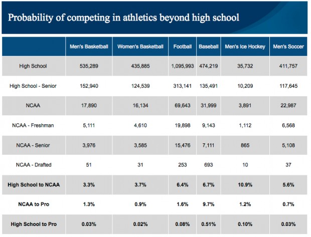
Let’s start out with some statistics. This table is the result of a study conducted in 2012 by the National College Athletic Association on the probability of high school athletes being drafted by professional teams.

If you take the time to read the entire table, you’ll see that the chances are slim that high school athletes will make the pros. But as presenters, we don’t want to make our audiences read tables to draw their own conclusions. It is our job to present the data in such a way as to make them meaningful.
Let’s see how two presenters might tackle the problem. I’ve asked them to highlight the data for men’s basketball, football, and baseball.
Presenter #1
“A lot of high school athletes are dedicated to their sports, hoping that one day they’ll make the pros and earn a big salary. But the odds are against it. According to a recent NCAA study, here’s the reality:
“As you can see, chances are that a high-school athlete won’t be able to make a career out of his sport as an adult.”
Presenter #2
“A lot of high school athletes are dedicated to their sports, hoping that one day they’ll make the pros and earn a big salary. But the odds are against it. This year, a study was done by the NCAA about exactly what percentage of high school athletes actually make it to the pros.
“Out of close to 153,000 basketball players who are seniors in high school, 50 will make the pros. That’s only zero point three percent! Ninety-nine point nine seven percent don’t make pro.
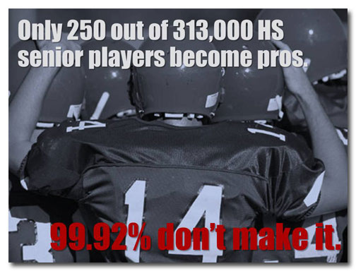
“The chances that a high school football player will become a professional athlete are marginally better. Out of about 313,000 high school senior football players, slightly over 250 will be drafted by the pros. That’s zero point eight percent of the high school number, meaning that ninety-nine point nine two percent don’t make it.
“If the kid’s a baseball player, his chance increases to a whopping one half of one percent. Out of about 135,500 kids, almost 700 of them will become pro ball players and ninety-nine point five percent of them will not.”
Why Presenter #2 does a better job
Both presenters started out with the same data, but the two approaches are very different. Presenter #1 has lifted the data straight out of the table and has put it into the dreaded bullet point format (*shudder*). He leaves it to the audience to read the data rather than talking about them. This is a very passive approach and does little to capture the audience’s attention.
Here’s what makes Presenter #2 more successful than Presenter #1:
- The numbers on Presenter #2’s slides are slightly different; he has rounded the numbers up or down and has used the word “about” to describe them in his script. He felt comfortable doing this because these changes are statistically insignificant.
- He has broken a single slide up into three individual slides, each focusing on a different sport.
- He’s used photographs of young athletes to illustrate the concept of “high school athletes.”
- Instead of focusing on the numbers of people who do make it to the pros (e.g., .03%) he has highlighted the percentage that doesn’t (e.g., 99.97%) and has put this number in bold red text. Because the point of the presentation is that the majority of high school athletes fail to make the pros, it makes more sense to show the data this way.
- The red text contrasts very well with the photographs of high school athletes doing their best at sports.
- What he says is much more lively than what Presenter #1 says.
If you want people to care about data, you have to give them a reason. Simply presenting them in a table or as bullet points isn’t going to liven up your audience. You have to do that yourself.


Absolutely great! Can’t you revamp my whole Powerpoint?