Doctors are highly trained professionals, but not necessarily the best at expressing themselves through their presentations. Here’s how one slide with too much information gets broken out across four slides.
Before
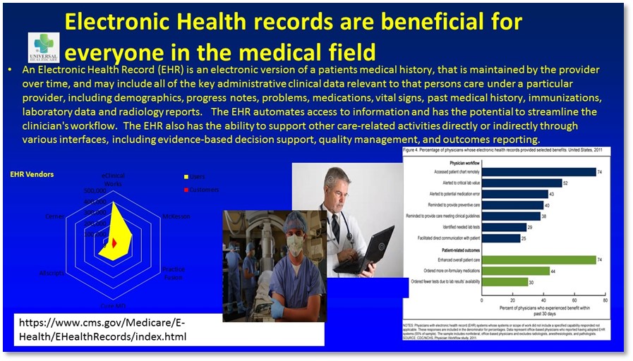
Problem 1
There’s waaaaaayyyy to much stuff on here! Some of it has gotta go, like that alphabet-soup URL. Other information needs to be conveyed in a series of slides.
Problem 2
The colors are Circa 1989. We have to do something about this!
Problem 3
The graphs are hard to read. The one on the left makes no sense and the one on the right has tiny, tiny text.
Problem 4
The photo of the doctor with the laptop has watermarks all over it, which means that it has not been properly licensed for use in this presentation.
After

Solution 1
The title was edited and used as the only copy on Slide 1, and that paragraph of yellow text ended up in the Speaker Notes. Information was broken up across four slides and large photos were added in place of the small ones.
Solution 2
A new palette was created that complements the colors in the logo.
Solution 3
I changed that spider web graph into a table. Although I don’t usually recommend tables in PowerPoint presentations, I thought that in this case it was the best way to convey the information. The speaker could rest on this slide for a minute to give people a chance to read the data, then talk about what the data mean. The other graph was a little more challenging, because there were only two data points that showed a clear positive result from using Electronic Health Records. So I called these out as a typographical infographic (try saying that ten times fast!) and put the other information into a bar graph that’s easier to read than the original.
Solution 4
I sourced a royalty-free image of a doctor using a laptop to enter information about a patient and applied the logo onto his lab coat.
In conclusion…
Everybody hates TMI slides. Do the world a favor and break information across multiple slides. This doesn’t necessarily add time to your presentation and it allows the audience to absorb information a little bit at a time.
[button link=”https://www.lauramfoley.com/gallery-2/” color=”orange” target=”_self” size=”small” title=”Back to Gallery”]Back to Gallery[/button]
[divider style=”shadow”]
Submit your own slide for a Makeover!

If you subscribe to the Cheating Death by PowerPoint newsletter you can receive a free Slide makeover! Here’s the deal: In exchange for permission to use your slide in the newsletter and on this website for promotional purposes, you’ll get the redesigned PowerPoint slide file to use in any way you like. So not only do you get access to a step-by-step video on how the slide was redesigned and the source file, you learn the reasons behind all of the changes!
You’ll also get a free eBook, Cheating Death by PowerPoint: Essential PowerPoint Tips, Tricks, and Best Practices, which includes loads of advice on how to improve the way you work with PowerPoint!
[button link=”https://list.robly.com/subscribe?a=c4115aa351a8e513f6e3b7af8ffaf943″ color=”default” target=”_blank” size=”small”]Subscribe to the Cheating Death by PowerPoint newsletter[/button]
[divider style=”shadow”]
[button link=”#top” color=”gray” target=”_self” size=”small” title=”Back to top”]Back to top[/button]
You must be logged in to post a comment.