Be sure your title slide isn’t dull when you’re presenting about cutting-edge topics!
Before

Problem 1: Plain typeface
Ariel has got to be the boringest typeface available on the Windows platform. Yes, I know “boringest” isn’t a word. Sue me.
Problem 2: Tiny graphics
It’s nice that an attempt was made to liven up the slide with graphics. Unfortunately, they’re tiny and help to create an unbalanced layout.
Problem 3: Layout of venue name
Sometimes conference presenters need to use the PowerPoint template provided by their hosts. When a conference template is unavailable, people often call out the name of the conference in their title slide. Using a blue bar at the top of the slide, however, makes it compete with the rest of the information on the slide. Plus, it probably doesn’t look anything like the conference template, so it looks odd.
After

Solution 1: Better colors and typography
A blue palette is often associated with science and technology so that’s what I’ve used in the slide makeover. The new typeface is Segoe, which is Windows-standard but not very common for some reason. Varyting the size, color and weight of the type makes the layout more vibrant.
Solution 2: Added background photos
Instead of going with the more obvious microscope/bacteria/petri dish images, I’ve used cost- and copyright-free abstract images downloaded from Pixabay.com and recolored them to suit the template.
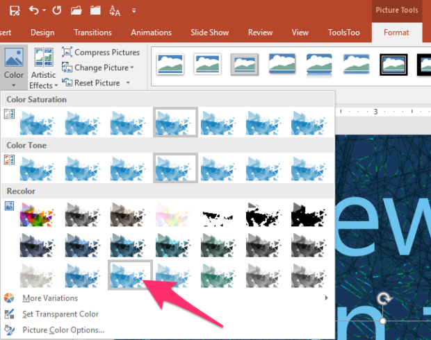
Recoloring placed photos in PowerPoint
It’s pretty rare that you’ll find the perfectly colored image you need for your presentation background. Fortunately, it’s easy to recolor photos in PowerPoint! The triangle pattern was recolored by clicking on it, then going to the Format tab, selecting Color then choosing the one I liked:
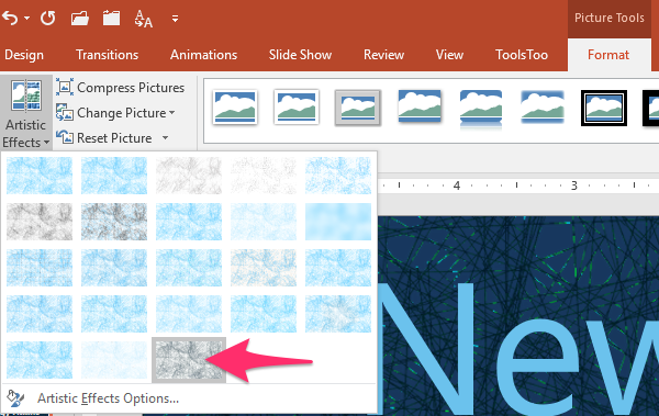
The abstract network illustration in the background was recolored by clicking on it then going to the Format tab, selecting Artistic Effects then choosing “Glow Edges.”
Solution 3: Emphasis on speaker, not venue
I opt for self-branding every chance I get. Since the venue hasn’t provided a template for the speaker’s presentation, she can emphasize herself, her credentials and her institution rather than the conference. Besides, the audience will remember what conference they’re at, even if it’s not onscreen at the start of the presentation.
In conclusion…
With just a little effort, a plain title slide becomes more exciting and suggestive of the cool presentation to come!
[button link=”https://www.lauramfoley.com/gallery-2/” color=”orange” target=”_self” size=”small” title=”Back to Gallery”]Back to Gallery[/button]
[divider style=”shadow”]
Submit your own slide for a Makeover!

If you subscribe to the Cheating Death by PowerPoint newsletter you can receive a free Slide makeover! Here’s the deal: In exchange for permission to use your slide in the newsletter and on this website for promotional purposes, you’ll get the redesigned PowerPoint slide file to use in any way you like. So not only do you get access to a step-by-step video on how the slide was redesigned and the source file, you learn the reasons behind all of the changes!
You’ll also get a free eBook, Cheating Death by PowerPoint: Essential PowerPoint Tips, Tricks, and Best Practices, which includes loads of advice on how to improve the way you work with PowerPoint!
[button link=”https://list.robly.com/subscribe?a=c4115aa351a8e513f6e3b7af8ffaf943″ color=”default” target=”_blank” size=”small”]Subscribe to the Cheating Death by PowerPoint newsletter[/button]
[divider style=”shadow”]
[button link=”#top” color=”gray” target=”_self” size=”small” title=”Back to top”]Back to top[/button]
You must be logged in to post a comment.