Client testimonials are a great way to boost your credibility. But to be effective, they need to be short, punchy, and easy to read!
Below is a re-creation of a slide from a webinar about a new STEM program for schools, presented by someone who works for a global information technology company. I have changed the text to Lorem Ipsum, which is dummy placeholder text, but the layout and title are the same.
Before
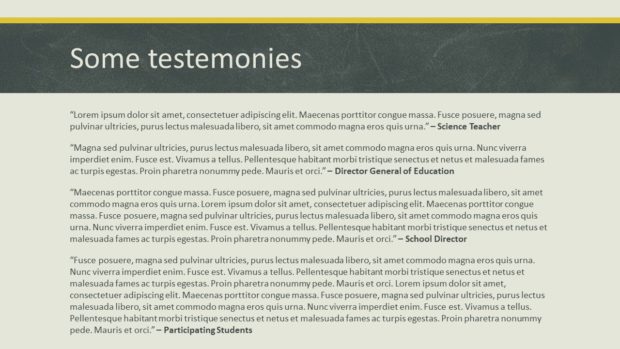
Problem 1: Typo in the title
Did you spot it? The word “testimonies” is spelled incorrectly. That not gud.
Problem 2: Poor word choice
A testimony is commonly given in a court of law or a recounting of a religious experience. A testimonial is a public tribute. You never know; there might be a smart-alec pedant in the audience ready to point that out!
Problem 3: Too much to read
Unless the presenter plans on being silent for about two minutes so the audience can read these testimonials (Top Tip: Don’t remain silent for two minutes while presenting a webinar.), they’ll never be able to read everything on this slide. I’m sure that these clients have a lot to say, but the presenter needs the audience to quickly understand how happy they are.
Problem 4: No pictures
I have encountered many slides in my career that could be improved by adding graphics, and this one is no exception.
After

Solution 1 & 2: New title
The once-generic title has been changed to reflect how pumped everybody is about the program! We don’t need to call out the fact that these are testimonials because people will recognize the format when they see it.
Solution 3: Radically shortened testimonials
I have edited the text down to four lines per quote and left some space above the people’s titles to separate them. It’s not always easy to edit text this radically, but you really don’t want more because it’ll take too long for the audience to read. If the presenter is quiet for about 15 seconds, that should give everyone enough time to read all of the quotes.
By making each quote fit onto four lines, all of the text lines up left to right. It’s not vital to do this, but it’s a nice touch.
Solution 4: Added photos
Do you need photos of the exact people who said all this nice stuff? It’d be great if you could get them, but since these particular quotes have been attributed to titles of people rather than actual individuals, you can just find some photos that illustrate the types of people who could have made these statements.
And here’s a trick when you’re including head shots in a presentation: make sure everybody’s head’s about the same size and in the same position, and make all of the eyes align on the same line, left to right. When you resize and reposition the photos like this, you can often crop out distracting details.
It looks subtly weird when you don’t pay attention to image size and alignment, as you can see below:

In conclusion…
By using a descriptive title, reducing quotations to the fewest words possible and adding photos, a testimonial slide does a better job of communicating how crazy-happy people are!
[button link=”https://www.lauramfoley.com/gallery-2/” color=”orange” target=”_self” size=”small” title=”Back to Gallery”]Back to Gallery[/button]
[divider style=”shadow”]
Submit your own slide for a Makeover!

If you subscribe to the Cheating Death by PowerPoint newsletter you can receive a free Slide makeover! Here’s the deal: In exchange for permission to use your slide in the newsletter and on this website for promotional purposes, you’ll get the redesigned PowerPoint slide file to use in any way you like. So not only do you get access to a step-by-step video on how the slide was redesigned and the source file, you learn the reasons behind all of the changes!
You’ll also get a free eBook, Cheating Death by PowerPoint: Essential PowerPoint Tips, Tricks, and Best Practices, which includes loads of advice on how to improve the way you work with PowerPoint!
[button link=”https://list.robly.com/subscribe?a=c4115aa351a8e513f6e3b7af8ffaf943″ color=”default” target=”_blank” size=”small”]Subscribe to the Cheating Death by PowerPoint newsletter[/button]
[divider style=”shadow”]
[button link=”#top” color=”gray” target=”_self” size=”small” title=”Back to top”]Back to top[/button]
You must be logged in to post a comment.