How to ruin a chart
A pointless chart
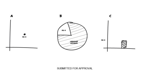
Check out this designer/client exchange from the excellent Clients from Hell website:
Me: The brief mentions a chart. Once you send me that I can add it to the report.
Client: Oh, you can draw the chart yourself?
Me: Sure, I can do that. But, based on what data? The chart just mentions 130k followers.
Client: Exactly.
Me: You want a chart with only this data?
Client: (getting impatient) Exactly! And please provide 3 layouts for approval, I don’t know if pizza or bars are best, I need to see it so I can choose…
Left with no data and “free reign” this is what I came up with:
© 2018 Clients from Hell; http://tiny.cc/m6fzxy
What the designer is struggling with is how to make the fact that the client has 130k followers meaningful. Without knowing the historical numbers, we don’t know if 130k is an amazing number or a laughable one.
Changing the context of the data
Here is a re-creation of the third chart sketch:
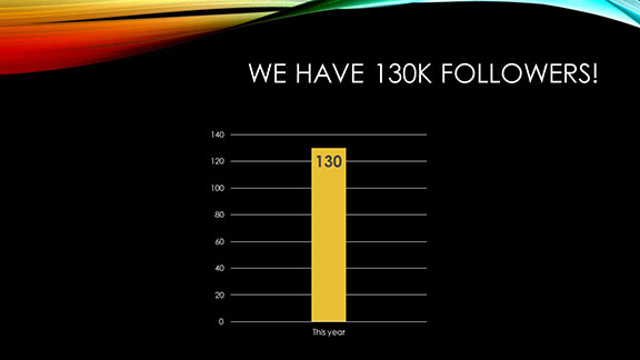
The chart shows us that this year we have 130,000 followers. High fives all around, right? Well, not necessarily…
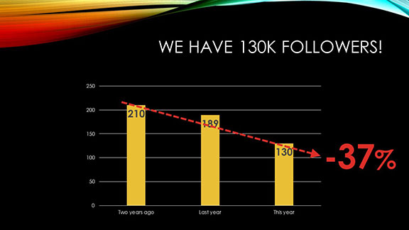
If two years ago we had 210,000 followers, then this year’s number of 130,000 represents a 37% reduction. We can now discuss reasons we lost followers, ways to attract new ones, and how to better engage with the ones we already have.
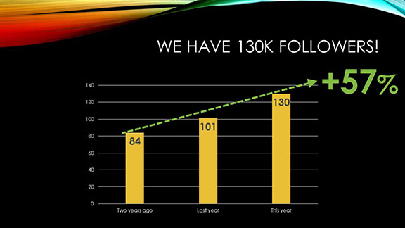
On the other hand, maybe two years ago we only had 84,000 followers and now we have 130,000. That’s a 57% increase! Let’s talk about how we communicate with our fans, how we make our group meaningful for our followers, and ways we reward people for being part of our group.
Why contextualization is important
You can see that by itself, the 130,000 number is meaningless. It’s important to show comparative data to demonstrate trends—downward, upward, or unchanged—so that people know whether they should be celebrating the number or striving to improve.
We derive meaning from data by making comparisons. Just showing a single data point will leave your audience guessing at what you’re trying to tell them.
You must be logged in to post a comment.