Before: Don’t let PowerPoint win!
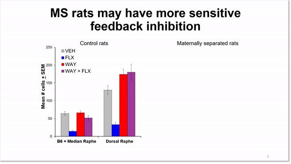
PowerPoint can do a great job of creating graphs if you give it some direction. But when you let it pull colors in from the default palette, then you get results like this. Add a repeating legend, rotated type and skinny little lines and you get graphs that are tough to look at.
Another problem is the way the data are separated on these graphs. The scientist has tried to focus attention on the important results by using animated arrows and circles. But the columns are too far apart on the slide, so it’s hard to compare data points from the graph on the left to the one on the right.
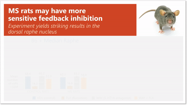
After: Redesigned charts
I needed to talk with the scientist before redesigning her slide to learn more about her experiments and to understand the terminology. These charts are showing the number of cells in the Median Raphe and the Dorsal Raphe, which are areas of the brain.
What her experiment revealed was that while results were similar for both the Control Rats and the MS Rats where the Median Raphe was concerned, there were big differences in the Dorsal Raphe. To make this more obvious, I regrouped the data so that the similar results in the Median Raphe are on the left and the striking results with the Dorsal Raphe are on the right. To call more attention to the results, I added a screen that highlights the last two columns for both groups of rats.
That took care of the data, so then it was time to move on to aesthetics. I showed just one legend, used different, more subdued colors, and added a big band of color across the top for the title. And because I like pictures, I added one of a cute little rat. Not necessary, sure, but the little fella adds visual interest, don’t you think?
Know what’s important
Grouping your data in a way that makes it easier for your audience to compare one set against another will help them to understand what’s different and what stays the same. And when you want to focus attention on a particular area of a slide, using a screen to obscure nonessential information will show your audience where to look.
You must be logged in to post a comment.