Before: What do those bubbles mean?
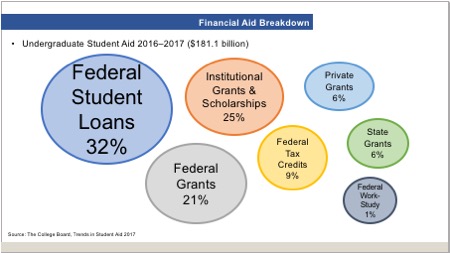
What this slide is trying to convey is the allocation of the $181.1 billion in undergraduate student aid distributed in 2016–2017. But it’s a hot mess. I appreciate how it’s easy to see that the largest percentage was distributed in the form of Federal Student Loans, since that bubble and text are the largest. But it looks like the Institutional Grants and Scholarships bubble is slightly smaller than the Federal Grants bubble, even though the percentage is larger. Each 6% allocation bubble is a different size. I’m guessing these bubbles were all drawn by eye and don’t represent actual percentages.
Gee, if only there were a graphic way to depict percentages that add up to 100.
After: Pie chart to the rescue!
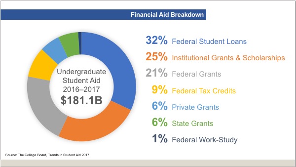
After verifying that the percentages do indeed add up to 100, I chose to use the chart style that best portrays that fact: a pie chart. Here’s what else is going on:
- I snazzed it up by making it a donut pie chart and moved the text from the top of the slide to the donut hole.
- Rather than using a legend to tell you which color means what data point, I made the data labels the same color as the wedge in the pie chart.
- The labels are typeset separately so that I could use tabs to make the numbers align correctly. The first tab is right-aligned for the percentages and the second tab is left-aligned for the descriptive text.
- The percentages are large and bold, to draw your attention.
Pie charts can be the perfect choice
For showing percentages that add up to 100, pie charts can’t be beat! Pie charts make it easy to see at a glance which portion of the whole is the largest and which is the smallest. As always, the less you make the audience work to understand you, the more quickly they’ll get what you’re saying.
A pie chart doesn’t do much to soften the blow of paying for a college education. But at least it makes the data easier to understand.
You must be logged in to post a comment.