For values adding up to 100%, a pie chart is a great way to show data. But some pie charts are better than others. For this makeover, I’m going to show you how to turn a mildly infuriating pie chart into a great one!
Before
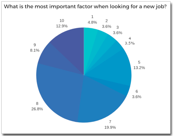
This pie chart slide was included in a newsletter I subscribe to. This chart has muchos problemas, chief of which is that there is no legend, so there’s no way to tell what factors the numbers 1–10 represent. An inquiry to the publisher went unanswered, so I have no idea what the most important factor when looking for a job may be. That’s the primary problem with this pie chart.
The other problems are visual. The wedge colors are so similar that they blend together, so the most important factor, which happens to be “8” (whatever that is), doesn’t stand out. And while I applaud the choice to make the chart take up most of the slide, doing so crowds out the title.
After
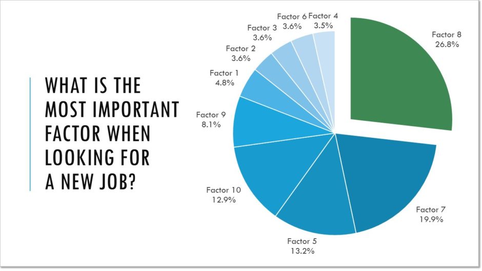
Here’s what I did to improve this chart’s usefulness and readability:
- By moving the title to the side, I created more room for the pie chart.
- I reordered the factors so that, reading clockwise from the top, the percentages are in descending order.
- I made the wedge representing the most important factor green and pulled away from the rest of the pie, which attracts attention to that data point.
- By adding white outlines to the wedges, I was able to keep the similar blue tones while visually separating them.
In know it’s a little jarring to see the factor numbers out of order, but these are just placeholders for the actual data. If I were designing this chart in real life, I’d use short phrases to describe each factor and rearrange the data labels to fit. Hopefully, by that time the publisher would’ve returned my calls so I’d know what the factors actually are!
You must be logged in to post a comment.