Wouldn’t it be great to use a cool, unusual font in your presentation so that it doesn’t look like everyone else’s? The answer to this question is…it depends.
A question about fonts
This morning, I received an email from a graphic designer buddy of mine:
Hey quick question. I’m doing a very simple PowerPoint template for a client. I used the Oswald Font, which I’ve embedded into the template. I was watching a tutorial today that said one should NEVER embed a font.
The client needs to share this templates with both the inside team and outside partners, who likely won’t have Oswald. What is your recommendation?
Is the Internet right? Should one NEVER embed fonts into PowerPoint templates?
This time, the Internet didn’t lie: embedded fonts in a PowerPoint template are usually a bad idea. Although using nonstandard fonts can make a presentation stand out in a good way, the potential problems can outweigh the benefits. ESPECIALLY when a template will be used outside of an organization, as my buddy stated.
The biggest problem is cross-platform compatibility
Even with an embedded font, it won’t look the same on every device. For my test, I created a file using the PC version of PowerPoint and embedded two fonts, Blambot Custom and Harlow Solid Italic. Here’s how they look on different platforms:

PC version of PowerPoint: PASS

Mac version of PowerPoint: FAIL

OneDrive, accessed on Google Chrome on a Mac: PASS
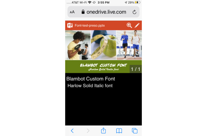
OneDrive, accessed on an iPhone: PASS
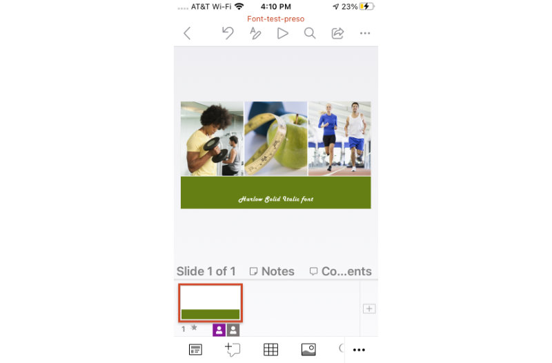
PowerPoint app on iPhone: FAIL
People generally can’t tell the difference
You may be tempted to use a nonstandard font in a PowerPoint template so that your organization’s presentations look like all of the other marketing collateral they produce (e.g., website, posters, printed materials, vehicle graphics). That’s the main purpose of a PowerPoint template, right? To ensure uniformity?
If you’re a graphic designer, brace yourself for a hard dose of reality: a lot of non-designers can’t tell the difference between similar looking fonts. What’s more, they often don’t care if the font is different. I know, shocking, right? But it’s true. So when their devices make a font substitution, thereby ruining the uniformity, many times it will go unnoticed.
File bloat
If these reasons aren’t convincing enough, let me put a third nail in the coffin: embedding complete font sets, which you need to do for a template, makes your files HUGE. The test file I created, with its three low-resolution images and two embedded fonts, is 4MB. Imagine how big that file will get when I add slides, photos, video, and other multimedia! Files can get very big, very quickly. This makes them problematic to store and share.
Is it ever OK to use nonstandard fonts in a template?
The short answer is “rarely.” I only use nonstandard fonts when I’m creating my own presentations and present from my own laptop. I’ve had clients insist that I use “their corporate font” in PowerPoint templates I’m designing, despite my warnings. Every time, they come back to me complaining that the text is wrapping funny or it doesn’t look the same on one computer as it does on another. Every. Single. Time.
The Solution
The easiest solution is to choose a standard Windows font that is the most similar to the nonstandard one. That way, the template will look the same on all devices. But if you really, REALLY want to include a nonstandard font in your presentation, you can simply type your text, select the text box, cut it, then paste it as a picture. It’ll be uneditable after that, but boy, will it look swell!
You must be logged in to post a comment.