Color is a huge part of design and communication, but it’s often ignored by people banging out PowerPoint presentations at the last minute. This can be a big mistake for several reasons.
Colors are part of your brand.
A company’s brand is much more than just a logo; colors play a large part in reinforcing corporate identity. Consider the following example:
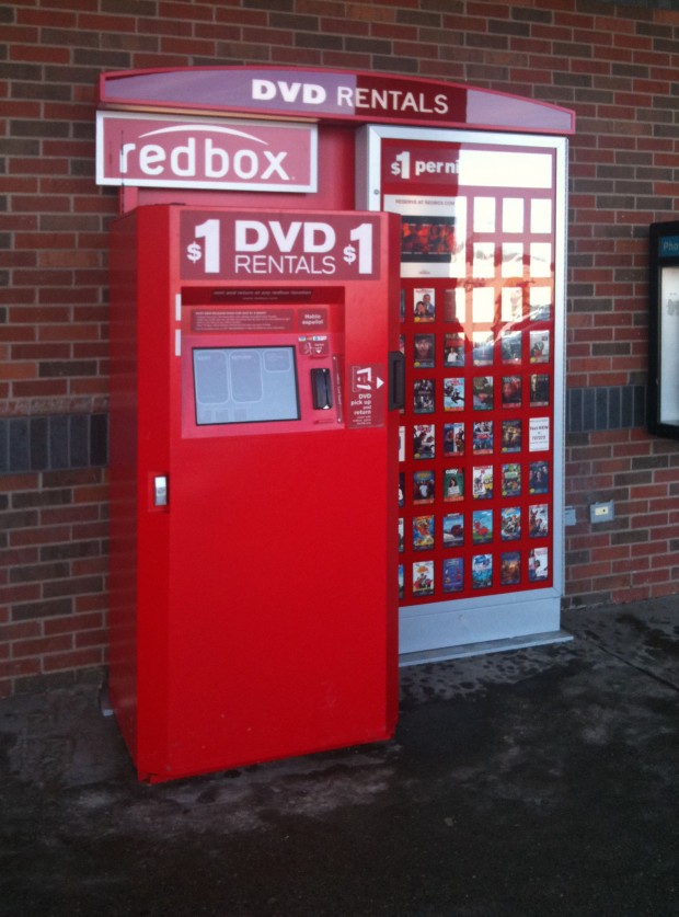
Here’s a Redbox kiosk that is on the sidewalk in front of a Central Massachusetts supermarket. It’s a red box, get it? Redbox. This kiosk is an obvious extension of their brand because their signature color is red.
Now let’s look at picture of another Redbox kiosk, this one located in a Walmart:
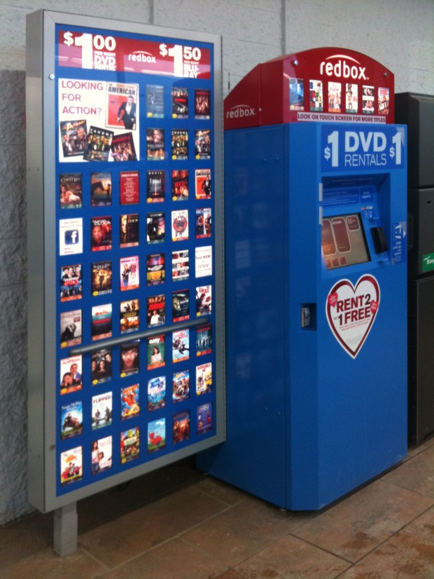
Hey, what just happened? Everything is blue now except for the little bump on top. It’s still a Redbox kiosk, but it’s not red anymore. Why not? Here’s a hint:

Red is the color of Walmart’s arch-rival, Target. Walmart doesn’t want anything in their stores that remind their customers of the competition, so they require Redbox to put a differently colored kiosk in their stores. And Walmart is such a huge, influential retailer that the folks over at Redbox were only too happy to comply in exchange for kiosk placement.
How does this relate to PowerPoint? Well, if your company has spent loads of money on branding then your logo and corporate palette (what we fancy designers call the colors a company uses in its marketing materials) should be applied to all marketing communications, including PowerPoint decks. That’s because brands are built on the principle that all of a company’s marketing communications look like they came from the same place. They all use the same logo, design style, and colors. When PowerPoint presentations deviate from the standard it erodes a company’s brand by not being part of this combination. They look different, unprofessional, last-minute.
Build your brand by sticking to the company colors in your PowerPoint decks.
The wrong colors make slides illegible
This is an easy-to-read slide:

Gorgeous, right? But at least you can read it, and that’s because the grey text really stands out against the white background. This is what you’d call high-contrast text. Here’s the same slide with a different background:

The text is the same color as before, but the new background makes it very hard to read the text. This is low-contrast text and it’s a problem that comes up again and again with PowerPoint. Make sure that the colors you choose for your slides are high contrast so that people will actually be able to read your slides.
Some colors are distracting.
Colors can be heavily associated with other things, making your slides unnecessarily distracting. What do you think your audience will make of this slide?
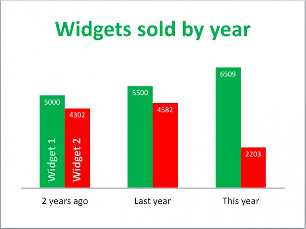 They won’t be concentrating on the amount of widgets sold, they’ll be thinking about Santa Claus and mistletoe, because red and green are Christmas colors. These colors bring a whole new meaning to the slide that is completely different from the desired message.
Here’s another slide with a distracting use of color:
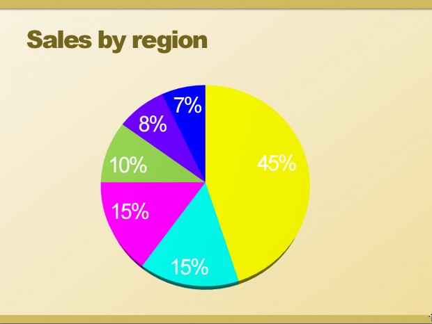 Sweet Mother of Mercy, what’s going on here? The colors look like they’ve escaped from the circus and they don’t go at all with the background colors. What’s more, there’s not enough contrast in the white number against the yellow wedge, making it almost impossible to read.
The bottom line
For PowerPoint presentations that reinforce your company brand the best way to go is to use a customized PowerPoint theme. If you already have a one, use only the colors that come standard with that theme. Don’t go all maverick and decide that your colors are better because you’ll dilute your brand and create unnecessary distractions for your audience. If you need a custom theme, then talk to me about designing one for you. Or you can create your own theme using colors that work with the background that you’ve chosen, that are easy to read against your background, and that look good with your logo.